Off the Grid has had an impressive launch thus far, topping the charts and racking up a massive player count. As far as crypto games go, it’s easily the biggest launch to date and has cracked the world of mainstream gaming fans, many of whom don’t even realize there’s blockchain involved. (To be fair, the crypto stuff isn’t fully integrated yet.)
But the initial hype of the launch is starting to cool off, leaving Gunzilla Games with its next big challenge: improving and evolving the game so that players stick around. Off the Grid needs to sustain a solid player base and keep improving until it is ready to leave early access, or it could miss its opportunity to be the game that introduces the benefits of blockchain to the gaming world at large.
After putting a good few hours into the game, I noticed a few things that could be improved. If they remain as they are, Off the Grid might struggle to keep a sizable player base and may never reach this level of popularity again. But given that it’s early access, the expectation is that improvements are in the cards—and here are five I’d like to see soon.
Add better damage indicators
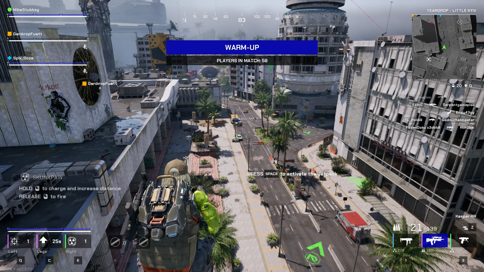
A screenshot from Off the Grid in early access. Image: Decrypt
This is, without a doubt, the single most annoying thing about Off the Grid right now.
It’s almost impossible to know how much health you have left without looking directly at the tiny health bar in the bottom corner of the screen. The damage indicators don’t do a great job of letting you know you’ve been shot, but they are even worse at showing how much health you have left.
Other games use visual elements like bloodying the edges of the screen or making your view go black and white as you near death. It’s not a complex system, and there are probably better ways of doing it, but Off the Grid’s current approach certainly isn’t it.
Add a new map
This is planned in Off the Grid’s roadmap, but if you ask me, it needs to be moved up as the current offering isn’t great. Seemingly, in an attempt to do something different, the map is essentially just a long line… and while that sounds like a fun idea, in reality, it just makes things more annoying.
With the map being so thin, the circles are unlikely to be at either end, so there isn’t much reason to go to the very extremes of the map. The best place to drop is almost always the middle. A map with a more conventional shape would alleviate this issue, and the current layout can be marked down as a fun idea that didn’t quite hit the mark.
 Source link